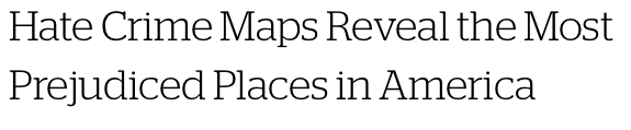
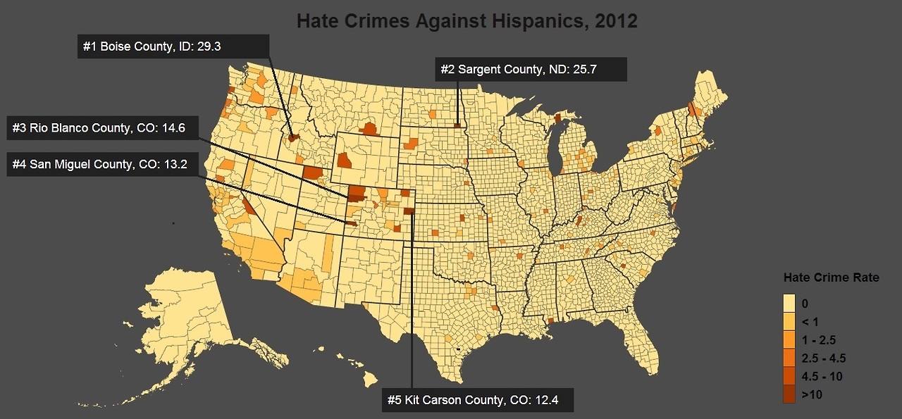
Hate crime maps reveal the most prejudiced places in America
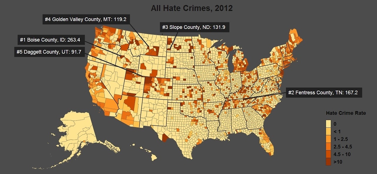
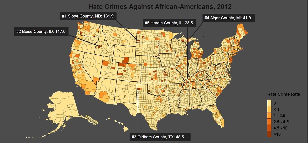
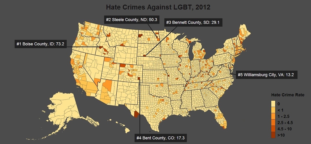
At least 6,593 hate crimes occurred in 2012, according to hate crime data compiled by the University of Michigan.
The maps below reveal where different groups are most likely to be victims of hate crimes. Each county is colored based on its hate crime rate, the number of hate crimes per 100,000 residents in 2012. The worst offenders and their hate crime rates are called out in each map.
We’re looking at you Boise county.
5 more maps | Follow micdotcom
Mmm. These maps looked highly suspicious and then you read the link and discover that they aren’t required to report hate crimes. So in fact, this is actually a more or less completely meaningless map.
It’s like when you look at the safety data stats for hospitals. You don’t want to go to hospitals with no incidents, because what that most likely means is that they don’t accurately report stats.

Hate crime maps reveal the most prejudiced places in America
At least 6,593 hate crimes occurred in 2012, according to hate crime data compiled by the University of Michigan.
The maps below reveal where different groups are most likely to be victims of hate crimes. Each county is colored based on its hate crime rate, the number of hate crimes per 100,000 residents in 2012. The worst offenders and their hate crime rates are called out in each map.
We’re looking at you Boise county.
5 more maps | Follow micdotcom
Mmm. These maps looked highly suspicious and then you read the link and discover that they aren’t required to report hate crimes. So in fact, this is actually a more or less completely meaningless map.
It’s like when you look at the safety data stats for hospitals. You don’t want to go to hospitals with no incidents, because what that most likely means is that they don’t accurately report stats.